Showing posts with label design. Show all posts

Tuesday, August 01, 2017

Roundup from GovHack 2017

Starting in a single Canberra venue in 2009, GovHack is now the largest open data hacking competition for government worldwide, with over 3,000 participants, coaches, mentors and organisers across 36 venues around Australia and New Zealand.

Over a 46-hour period participants including coders, creatives, data crunchers and facilitators, redesign and reimagine citizen services and use open data to visualise fresh insights into government decision-making, taking part in a competition with over 80 prizes and a prize pool of over $250,000.

The event is organised and run by volunteers, but GovHack has support from the Australian and New Zealand Governments, all Australian state and territory governments and many local governments across ANZ, as well as a range of corporate sponsors. This was the first year that the Northern Territory became involved with the event.

Many senior public servants drop into the event over the weekend, and have a keen interest in using ideas from GovHack within their agencies.

This year Accenture was the Platinum Sponsor for GovHack, the first time a corporation has taken such a significant interest in the event - a trend I hope continues as these types of event gain steam as a creative way for companies and governments to innovate quickly.

Accenture sponsored two awards, the ‘Into the New’ award for Australia challenged participants to demonstrate innovation and new thinking in all forms. This could be new ways to experience and interact with public data or new approaches to citizen experiences that help citizen and governments journey into the new together. It attracted 138 entrants from around Australia, from a total of 373 projects submitted.

Accenture’s ‘Re:Invention’ award for New Zealand challenged participants to design a citizen experience that builds on something government already does to deliver a more effective and engaging way of interacting. It attracted 12 entrants from Wellington, Auckland and Hamilton, from a total of 66 New Zealand projects submitted.


GovHack by the numbers
While GovHack itself is over for 2017, state award events will be held in August, and an international Red Carpet event for National and International Award winners in October. You can view the closing video from GovHack 2017 here.

All the projects created this year are online in the GovHack Hackerspace, available for inspiration and learning – remaining online to provide hundreds of fresh perspectives on how government can deliver more value to citizens.

you can read more about GovHack 2017 in this LinkedIn post by a mentor, or on Twitter.

Read full post...

Friday, September 30, 2016

Australian government ePetitions compared to international models

Australians might be surprised to learn that the Australian parliament only agreed to formally accept ePetitions in July 2015.

That was five years after it was formally recommended to parliament and follows a trend towards epetitions set by other digitally advanced democratic nations, such as the UK and USA.

In September 2016 the Australian Department of Parliamentary Services launched its epetition site allowing people to create and sign epetitions at aph.gov.au/Parliamentary_Business/Petitions/House_of_Representatives_Petitions/Petitions_General - yes that is quite a mouthful.

I've reviewed Australia's site compared to comparative sites released in the US, UK and Canada to form some conclusions on how well we've done.

However, unfortunately for Australians, the model used for Australia doesn't measure up well.

UK - ePetitions

The UK's epetitions site launched in August 2011 at petition.parliament.uk and has been restructured several times over the last five years.

Today it is a sleek, easy to access platform that hides all the technical mechanics the UK parliament requires for petitions behind a usable and simple step-by-step process.

It's very simple to find and sign a petition, with the process for responses explained clearly on each petition's page. 

Sharing tools are embedded to make it simple to encourage others to sign. It's easy to view signatures geographically by electorate (great for parliamentarians and respondents alike).

The data for each petition is immediately available via a standards-compliant data format.

The process for creating new petitions is also simple and seamless.

It uses plain English and employs a range of assistive approaches to ease first-time petitioners through the process. This includes examples of how to write a petition and flagging information that will be required in later steps so the petitioner can pre-prepare.

The site uses text matching to find similar petitions so that a petitioner can choose to sign a pre-existing petition, rather than create a near-identical one - a step that saves effort for both petitioners and for the public servants who need to manage the system.

There's clear warnings when a petitioner reaches irrevocable steps, and the system supports and encourages sharing - to help the petitioner get the petition to audiences who may wish to sign.

All in all it's a solid and well-thought out system with excellent usability - very important when considering that most people rarely petition government and need a helping hand to navigate what can be a complex and seemingly irrational process for those who do not think like bureaucrats or politicians.

USA - WethePeople

The US's epetitions site is similarly five years old - launching in September 2011. Named WethePeople and located at petitions.whitehouse.gov, the site is structured differently, but is just as simple to use, as the UK's version.

While the site doesn't offer the same geographic mapping as the UK site does, it does provide very clear step by step instructions for both signing and creating petitions and is equally clear on the goal number of signatures required for consideration.

The government's responses to epetitions (which must reach 100,000 signatures to get a response) are clearly provided with the petitions themselves, making it easy to understand what was asked and how it was responded to.

The US system requires that people creating a petition must create an account - a small barrier to entry, but one that helps with screening. 

It also makes it easy to track repeat petitioners - a useful thing for a government, if slightly invasive in privacy terms for an individual.

Something I don't like about the site is that after creating an account it sends a confirmation email with a randomly assigned password in plain text. People who don't respond straight away could easily get caught out with identity theft, although the site does force you to change it after you confirm your email.

However when changing your address the site does provide an idea of how strong your password is and makes helpful suggestions on how to improve it (something I think all government sites requiring login should do by default).

Once a petitioner has an account they also get a dashboard to track their petitions, though unfortunately it doesn't also track petitions they have signed or autofill your details when you choose to sign a petition. This may be done for privacy reasons, but there's also huge convenience and utility in these steps.

The process for creating a petition is brilliant - laid out step by step.  

The ability to look at past successful petitions as examples is a nice touch and very helpful for first-time petitioners, and the filtering approach helps guides people to structure their petitions well. 

Later in the process petitioners also get to tag their petitions by topic, providing a useful way of filtering them to the appropriate agency and providing useful statistics for the government on the 'hot topics' for citizens.

The system doesn't have the matching of similar petitions as the UK system does, but nevertheless it's very polished and well executed.

Canada - e-Petitions 

Now the Canadian epetition system is interesting as it debuted in December 2015, less than a year before Australia's system. As such it hasn't had the same amount of time as US and UK sites to refine and restructure based on use. but has the opportunity to learn from their experiences to implement the best of both sites in a Canadian context.

The site is very simply named petitions.parl.gc.ca, similar to the US and UK epetition platforms, but has taken a different approach to either the US or UK sites.

There's no ability to see the latest petitions on the main page, users must use a search tool or click to see all live petitions. This shifts the propensity for people to browse and choose to sign by adding a small 'one click' barrier to the visibility of petitions.

When a user clicks on 'View all petitions', what they see doesn't really provide enough information to decide whether to sign. Another click is needed to view the details of any specific petition. However the screen does help people refine down to a topical area quickly, unlike the US and UK sites and the keywords by petition are useful, if perhaps put ahead of more useful information such as the title and summary of what a petition is asking.

The language, unfortunately, is a touch more bureaucratic than in the US and UK sites, with petitions titled by number and reference. These may be useful to bureaucrats, but have limited meaning for users and could have been hidden from petitioners and respondents.

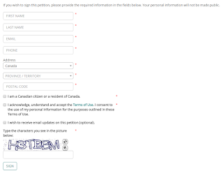
Petitions provide a numerical breakdown of respondents by provinces, but no map view and no easy way to download the data without screen-scraping.

Responding to a petition is slightly more complex than in the US and UK epetition sites, with it being mandatory to provide an address and phone number as well as the usual name, email address and confirmation that you're really a resident of the country. The response form is also less friendly than the other sites, using now old-fashioned red asterisks to denote mandatory fields.

Creating a petition involves an equally complex sign-up form, where a user must avow they're a Canadian - so I've not looked into the creation process. I do anticipate that it would not quite be as sleek and refined as the US and UK versions.

The responses to petitions, like in the US site, include all petition information and those that have been responded to can be found easily through the top menu of the site. However the responses are provided as PDFs rather than within the page. This adds an extra step to the process of reviewing a response and most are only one page long, so I feel this is a poor approach, adding complexity with no benefit for users.

Australia - e-Petitions

Similar to the Canadian site, Australia's epetition site is quite new, so some rough edges can be expected. 

However I did not expect as many rough edges as I found, given there's some excellent examples above to learn from.

Also as the code for WethePeople is available as opensource, it is it relatively quick and easy to start with all the US's experience and build from there. 

To start with, Australia's epetitions site doesn't have a short web address like petitions.aph.gov.au, it is deeply buried in the site at www.aph.gov.au/Parliamentary_Business/Petitions/House_of_Representatives_Petitions/Petitions_General

Now it could be argued that as Senate, House of Representatives and Committees might all accept petitions but operate differently, it needed to be buried within each of these section of the site. 

However this could have been easily handled through a single multi-choice question in a petitions process, leaving all petitions to live at the same simple petitions.aph.gov.au address - without requiring petitioners to do the hard work of understanding how government operated.

On top of this the petitions process doesn't come up in the first page of search results when looking for 'petitions' - a critical but easily fixable mistake. 

This type of simple oversight dominates the entire Australian epetitions process, with it being pretty clear than the work was done with little reference to international benchmarks or usability testing.

Moving on to the actual processes, there's currently no petitions listed so it's not possible to analyse the process for signing a petition. I would have expected that the APH would have done some work to ensure there were a few petitions at launch, as other governments did. 

Clearly this wasn't the case, with the APH potentially taking more of a 'build it and they will come' approach rather than promoting the availability of the site widely before and during its launch. The impression that leaves me is that the APH didn't really want to create this site and doesn't really welcome petitions - they'd prefer to not hear from citizens or have the hard work of dealing with any resulting work.

Regardless of whether this was the case - the impression, or perception, is the thing - and the lack of any petitions to sign at launch reflects badly on the site.

Moving on to the creation process, the process for doing so is well explained in the first page (image above) - though with far more text than is necessary (as illustrated by the other epetition sites above).

Some of the steps on this page, and later pages, are not well communicated, using very subjective and bureaucratic terms - such as "Language (must be moderate)". 


I'm not sure what 'moderate' actually means and I doubt most Australians would be able to guess what a bureaucrat would consider 'moderate language'.

However using more words to explain these types of terms would be a mistake - instead the entire page should be written in plain English, aimed at about the 5th grade level. 

In fact I quickly tested the language on the main page, and it scored at a current grade level of 10.5 - well above what is considered acceptable. The subsequent creation pages score even higher, with terms bandied around that are rarely used outside of Canberra's bureaucracy and would serve to confuse, frustrate or even upset many Australians.

The process for filling in an epetition is OK, clearly stepped out, but with far too many steps (and words) on each page. There's no way to compare your petition with existing petitions - as the UK site does - though as there's no existing petitions to compare with I'm not too concerned about this as yet.

It will become a source of additional work for public servants and frustrations for users down the track however.

There's a lot more questions and information requested than in other epetition processes - with a lot of form fields to complete, which will effectively deter many people from establishing an epetition. Whether this is a good thing, however, depends on whether you're a bureaucrat first or a citizen first (I think it's a poor approach).

Nowhere could I see clarity on the thresholds at which you might get a response to a petition, making the entire process seem like a black box - a digital black box, but a black box nonetheless.

The entire process felt very cold and impersonal, unlike the UK and US experiences - which were warm and inviting.

Given parliament serves citizens, I think it is better to strive to leave users feeling they were important welcomed guests rather than nuisances and intruders into a hostile space.
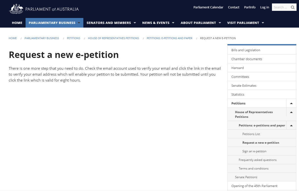
This lack of warmth was particularly characterised by the final 'thanks for submitting a petition' page - which neither thanked the petitioner, nor gave them a feeling they were important and valued. 

Even the title of the page remained 'Request a new e-petition' rather than thanking the petitioner for their engagement in Australia's democracy.

Given how often politicians and public servants complain that Australians are disengaged from politics and democracy, the way this entire epetition creation process was constructed makes it very clear that the government itself holds a lot of responsibility for pushing people away, rather than welcoming their contribution.

Summary

So given my review of the four epetition processes, from Australia, Canada, the UK and US, I can say that I'd happily and enthusiastically recommend both the US and UK approaches, slightly favouring the UK due to it's maps and sharing tools.

Canada's site is OK for a first attempt. It doesn't appear to have learnt a great deal from the US and UK experiences and asks more than it needs from citizens, but it remains usable and functional if not inviting.

Unfortunately Australia's epetitions site is a very poor effort, and reflects poorly on the government, our public service and Australia's claims of being innovative and digitally progressive.

About the most positive thing I can say about it is that at least we now have the site - so there's a starting point to improve from.

However any competent usability designer would not have built the site in the way it has been built - and it seems more of a 'tick and flick' developed with internal resources on little or no funds (not that it would have cost a great deal to have done a good job).

I'm very disappointed at the APH's efforts - and have created an epetition for people to sign accordingly (though I doubt it will make it through the APH's scrutiny process - which is far more involved than for any other jurisdiction compared).

I truly hope the APH spends more time looking at benchmarks internationally and can convince the government that epetitions are a key interaction tool with citizens, so having them feel invited and effective is critical for supporting a positive view of government.

I'll be looking in on the site from time to time to see how its going - and would happily help the APH improve the site if asked (in fact I reached out last July, but never heard from them).

This isn't just a box that government has to tick, it's a vital avenue for citizens to engage with government and an advanced democracy like Australia should recognise the importance of doing it well.

Read full post...

Wednesday, September 07, 2016

Don't ask for more information than you need (and make it clear why you're asking what you're asking)

I've just become aware of the ACT Government's consultation for a new license plate slogan.

Hosted at Your Say, the government is asking for ideas for a 30-character or less slogan, with the best ideas to be put to a public vote later this year.

I support this type of consultation approach - it provides for broad public input, with a screening step (via a panel of judges) to manage any inappropriate suggestions before a public vote.

The consultation also does a great job of explaining the process timeframe; when the decision will be made and when the license plate will be released.

One of the 'tricks of the trade' for consultations - and and engagements - is to ask the minimum number of questions required to meet the purpose of the process.

While there's often temptation to ask a few additional questions, where data might be interesting but is non-essential to the consultation's purpose, each additional question can reduce the response rate significantly.

These additional non-essential questions can also call into question what the consultation is actually designed to achieve. This can, at worst, lead to suspicion and loss of trust, but at minimum is likely to cut the honesty and number of responses, potentially damaging the ability of the consultation to achieve its purpose.

Sometimes, of course, there can be questions that appear non-essential but are necessary for the consultation to achieve its goals. In this case, the organisation engaging should make it as clear as possible why the questions are being asked, without damaging the engagement process itself.

Unfortunately it seems that the ACT government hasn't fully thought this through in its license plate slogan consultation.

Alongside asking for the slogan and where the respondent lives (important for getting ideas expressly from Canberra residents), the slogan also asks for the name and a contact number/email, as well as age and gender.

While the consultation does a good job of explaining why name and contact information might be useful, so that the finalists and winning respondent can be contacted, it's unclear why either age or gender are required in this process.

Age is a compulsory field while Gender is optional, but realistically neither is important information in the review process, nor is there an explanation as to why the ACT government would need this information.

Now this might seem a trivial thing to the agency involved in the process, after all age and gender aren't hugely personal information and, in the case of gender, is often determinable from name alone.

However by adding these fields - whether compulsory or not - the response form becomes that much more complex, and can discourage some people from responding.

That doesn't mean that this process won't get a good response rate, but it is likely to be less than it would otherwise be.

Of course it's hard to prove this in this case, as we don't have the luxury of an AB test to compare approaches - but from experience, overall responses go down when additional (and unnecessary) questions are asked.


Read full post...

Thursday, July 07, 2016

There's no silver bullets, but there's silver toolkits

During this Public Sector Innovation Month, I thought I should focus my eGovAU posts a little more closely on the topic of innovation.

I've commented previously on the 'shiny new thing' issue - whereby humans place unrealistic expectations on a new device or approach to solve a long-standing existing issue.

It's an issue that occurs regularly - and is even supported and encouraged commercially, where new products are regularly released with a 'unique' ingredient (not always unique), or a 'new' approach (not always new) promoted as solving a 'problem'.

Of course sometimes these unique ingredients aren't unique, the new approaches may not be new - and the problem may not be one that has kept people awake at night.

As a marketer I was trained on how to do this at university - either find an existing problem, or make people aware of a problem they hadn't thought about, so that it could then be fixed with a specific product or approach.

Products that are examples of this approach include 'Permeate-free' milk and many toothpaste additives advertised as promoting 'advanced whitening' or 'tartar control'.

Examples of approaches that fit into this basket include 'Nudge theory' (Behavioural Economics), 'TQM' (Total Quality Management) and Lean Methodology. All have positive applications, but none is a 'silver bullet' in all circumstances, and they can sometimes be applied to solve the wrong problems.

The same psychology applies in many human pursuits - from health care to the battlefield to management and government policy development.

New approaches are regularly discovered (or rediscovered) and promoted as silver bullets.

In most cases they aren't scams - they genuinely work, but only deliver measurable improvements within certain circumstances. This leads to case studies and advocates, even when they deliver limited or no value - it can be hard for senior leadership to say that the approach they supported and endorsed didn't lead to any significant positive impact on an organisation.

However over time it can often become clear that the success of these approaches applies only in a narrow set of circumstances or is based on factors that aren't related to the approaches themselves. At this stage another new approach often takes off.

This cycle may take years, or occur in a few months - what is traditionally called a 'fad'.

There can even be several new approaches at the same time, producing quite a heady environment where people and organisations fall into competing camps and can often expend more resources and energy on justifying why their new approach is better than on actual execution.

In reality there are a few situations where there are silver bullets. For example vaccines have been a silver bullet for population disease control.

Yes there's still a few cases of diseases we've vaccinated against, but the widespread suffering and death, long-term health issues and economic dislocation that accompanied mass outbreaks of major diseases, has been alleviated to the point where few have a living memory of these issues - leading to the present-day pushback we're seeing from people who have never experienced a mass vaccination-free world.

However in most cases new approaches are not silver bullets. They may provide an incremental improvement in the delivery of solutions to problems, or provide a solution within a limited set of circumstances, but do not have the widespread paradigm-shifting impact that the notion of a silver bullet encompasses.

Instead organisations should consider developing what I term 'silver toolkits' - collections of both new tools and approaches and existing methods applied in new ways that collectively provide development and delivery improvements to outcomes.

The notion of a 'silver toolkit' moves organisations away from any reliance on a single approach to achieve universal results - the equivalent of having only a screwdriver to solve any mechanical problem.

The approach also provides greater license to customise approaches and tools to specific situations, allowing for ongoing evolution in the adoption of new approaches rather than adherence to a rigid, unalterable formula for success that doesn't adapt to the specific attributes of an organisation.

So next time your organisation is considering a new approach or tool that its advocates claim is a 'silver bullet' for any or all problems you're seeking to solve, consider instead whether you can add it to your 'silver toolkit' - a non-exclusive set of new approaches and tools that your organisation can flexibly apply as appropriate to address emerging challenges.

Read full post...

Wednesday, May 25, 2016

The feng shui of innovation

Many organisations have begun integrating words from the language of innovation into their vocabularies.

It's increasingly common to hear terms like 'fail fast', 'lean', 'agile', 'prototype', 'user-centric design', 'discovery phase' and 'startup' used by both senior leaders and line staff when discussing the design of their services and development of IT solutions.

More organisations are announcing roles specifically focused on cultivating innovative ideas, and implementing systems and technology solutions to support innovation processes.

All of these steps, to a greater or lessor degree, help surface the innovative thinking already within these organisations. I've seen a number of cases where managers were positively surprised at the number and variety of innovative ideas they managed to uncover with a simple idea crowdsourcing process.

I find it predictable that organisations experience an initial flood of ideas once language, systems and permissions conducive to innovating are introduced into an organisation.
In many cases these were pre-existing ideas which had been bubbling away in the minds of people across various organisational nooks and crannies, laying dormant until there was an opportunity to be heard.

However once this initial surge of pent-up ideas has been spent, organisations will need to think carefully about how to foster and sustain a deeper ongoing innovation culture.


While permanently adapting the language, approvals and systems is a good start towards fostering long-term innovative behaviour, organisations should also closely consider the physical environments they create for their workers, and how their staff are equipped and organised to achieve business goals.

I call this the feng-shui of innovation.

Feng shui is a Chinese philosophical system for organising objects and spaces to generate positive flows of energy.

Good feng shui in a room or building supposedly leads to good fortune - making people more productive and energised, feeds money in (rather than out) and leads to greater success. Bad feng shui does the opposite - supposedly leading to ill fortune.

While people have varying views of the value and spiritual aspects of feng shui, the 3,000 year philosophy includes practical approaches that inform the architectural design of buildings and the arrangement of objects and spaces within them. The use of feng shui to create positive spaces remains widely applied throughout China and popular to some degree across the western world.

Regardless of the virtues or otherwise of feng shui practice, it is widely understood that how spaces are designed influences how people feel and interact within them. A space that is confined and crowded, with little natural light, tends to create a feeling of oppression, where as spacious, well lit environments can have people feeling that a weight has lifted off them.

This understanding has been widely applied in the fields of architecture and interior design to design spaces that create certain impressions. Churches have high ceilings deliberately to create a sense of reverence and respect, and supermarkets choose cluttered corridors to create an impression of being bargain priced and place impulse purchases at checkouts and the front of the store and staples at the back to increase sales.

Equally offices and other workplaces can be deliberately, or accidentally, designed and configured to support or discourage certain types of moods and behaviours. Research has found that people are less likely to collaborate if office partitions are high and around every desk, whereas having large common areas painted in relaxing colours with amenities like coffee machines encourages people to associate and share information.

Certain types of office environments are also likely to encourage or discourage innovative behaviours and organisations serious about innovation often create specific innovation spaces within their offices where staff can interact differently to at their regular desk.

I've seen some great examples of these types of spaces in co-working offices, in organisations like Google, Telstra, DFAT, the Digital Transformation Office and elsewhere, as well as in the premises of innovation specialists like EdgeLabs and ThinkSpace.

However in many cases these spaces sit on the 'edge' of the organisation. Only specific teams regularly access these spaces, with most staff spending the majority of their time in cubicle city and only occasionally being invited into these innovation spaces for a specific training or innovation session.

For organisations who wish to transform how all their staff behave, promoting top-to-bottom and end-to-end innovative thinking, having a discrete space people can go to is likely to have limited impact on the overall transformation effort.

While people spend most of their time in a specific space, they will adopt the thinking patterns best suited to that space - which may stymie innovation thinking.

So promoting innovative thinking can't end with language and systems, it has to take in the environments in which people are expected to work - how they are organised and the objects placed within them.

The opportunity for larger organisations is that they have a level of capability to test different office configurations to determine which layouts and approaches best support the organisation's innovation and other goals.

Rather than making every office space identical, they have the ability to AB test office spaces, iterating the design as they see the impact of different environments on the workday behaviour of staff.

This should be done in an above-board manner, with staff aware that the organisation is testing different layouts to determine which helps them be most effective and happy.

Taking this approach, treating the office environment as an ongoing experiment for improving productivity, would thereby allow larger organisations to apply and demonstrate their innovative thinking by applying it to improving innovative thinking.

Only by performing this form of 'feng shui of innovation' across their work environments, will large organisations embed the innovative thinking they wish to cultivate, right across their organisational structure.

Read full post...

Tuesday, March 29, 2016

Australian governments need to stop treating citizens as free consultants

Across April I'm spending a week participating in government-run sessions to contribute to the democratic life of our nation.

I'll spend two days with CSIRO, supporting their startup commercialisation programs, a day with the NSW Department of Transport supporting their deliberations on future transport needs and policies and a day with the Department of Prime Minister and Cabinet supporting the open government partnership process.

Plus there's associated travel and preparation time - including several return drives to Sydney from Canberra.

Every bureaucrat and politician involved in these sessions will be paid for their time and have their travel costs covered. 

Every consultant employed by the government to organise, manage, promote and report on these sessions will receive due compensation - paid at their going market rates.

However the participants who give up their time and intellectual property to provide input to government won't receive a cent in payment from the agencies for any of their time commitment. Not even to defray travel or accommodation costs.

Some of the participants might attend representing a university or corporate interests - so while the government won't pay for their time or travel, their employer will. In return their employers will expect some form of benefit in having them attend, whether it be through building or exhibiting expertise, influencing policy directions, senior connections or another form of  potential commercial benefit.

However for other participants, including myself, our involvement is a cost - a personal cost (spending time in another city, far from loved ones), and a professional cost (losing days of productive income time).

I've been prepared to sustain this kind of cost due to my passion for helping government take full advantage of digital ('digital transformation' as per this year's buzz phrase), improving citizen-government engagement to support and strengthen our democracy, and supporting Australian innovators to create the export industries and jobs that our country will need to remain successful throughout this century.

Indeed I've calculated that my personal investment in these goals has cost me hundreds of thousands of dollars in lost income over the last ten years.

Now I've also had paid gigs helping government to improve in some of these areas - both as a bureaucrat and a consultant, which puts me in the position of seeing both sides of the equation.

However, make no mistake - for most Australian citizens participating in democracy can only be considered a hobby.

While the government 'professionals' (bureaucrats & consultants) get paid - the hobbyists (citizens) do not.

It's no wonder that most Australians do not respond to government consultations, attend government policy events or participate in significant democratic exercises.

It's no wonder that Australian governments find that the same organisations and individuals constantly respond to their requests for attendance at events and round-tables. Organisations with commercial interests and individuals with either commercial or close personal stakes in the outcomes.

Most people can't afford the time off work to provide their views and insights, even when they have expertise on a topic, leaving a deep well of Australian knowledge and ideas untapped.


Now some might claim that it would be inappropriate for government to pay citizens for taking an interest in democracy and contributing their time to inform or influence policy - after all, all that work is being done directly for the citizens' benefit.

However the majority of citizens now only contribute because of commercial benefit to their employer or themselves, or because they have the financial freedom (or willingness to sacrifice lifestyle) to get involved. Most Australians don't contribute at all beyond voting. So this view of citizens as 'free consultants' is quite outdated and doesn't reflect the realities of the real cost of participating in democracy.

When the Icelandic government ran a constitutional event, inviting 300 representatives from across the country to participate in the design of their new constitution, they paid the participants the equivalent of a parliamentarian's salary for the day - plus travel and accommodation costs.

In a country like Australian where people off the street are paid $80-100 to spend an hour or two looking at product concepts and give an opinion, it seems ludicrous that governments won't pay a cent to citizens who give up their time to provide insights and expertise on policy decisions that affect millions.

If we want the best policies for Australia, governments need to at minimum be prepared to pay for the best participants to attend - covering travel costs to bring in citizen experts and leaders from all over Australia, rather than limiting the pool to citizens within driving distance.

Preferable we need Australian governments to budget respectful day rates for Australians who are invited and choose to participate, or who apply and are selected to participate in consultation events of significance to policy and program development. 

Read full post...

Friday, December 04, 2015

Australian Tax Office (finally) considering going digital by default, but walk and talk don't match

The Australian Tax Office (ATO) is currently asking Australians what they think of the idea of the ATO going digital by default.

As they rightly point out in the Consultation paper, the current ability of the ATO to do this is restricted by legislation, which often defines the channels by which certain transactions can occur or services be provided, not simply the desired outcomes and outputs.

This kind of policy blindness to digital is to be expected in legislation developed before the 1990s, or even the 2000s, and can take substantial time to unwind and correct. It's less acceptable (though sometimes still present) in more recent legislation - reflecting a failure to learn and understand the impact of digital on the modern world.

For the ATO these policy issues have meant a constant challenge to work within their legislative framework to still deliver the best possible services to clients, thereby prompting accurate and timely payment of taxes and funding the government's operations.

To complicate matters further, the ATO has been shedding highly experienced staff in a series of budget cuts that, in my view, have severely degraded their ability to operate effectively.

I am glad to see this consultation occurring, however feel that the way in which they are doing it leaves much to be desired and, in my view, weakens my trust in the ATO's ability to go digital by default in a manner that maximises tax compliance through making it easier and simpler for people to meet their obligations.

The form provided for feedback has some unusual restrictions on the number of characters used in responding to the consultation paper, making it difficult for those of us who care to fully flesh out our answers with evidence and perspectives.

When submitting the form there's no acknowledgement of the submission - a standard in most online engagement processes today in order to 'complete the loop' and have people feel listened to and acknowledged. I did (after 40 minutes) receive an email with my submission, which is good, but is hardly the immediate feedback people should expect.

On top of this, the consultation itself seems to focus on a 'stick' approach to gaining compliance as the ATO goes digital by default.

There's no discussion of how the ATO will ensure that digital services are better and easier to use than their offline equivalents in order to create a natural pull effect as people walk downhill to the easier way of completing their tax obligations.

There's discussion of penalties for people who are slow to shift to digital services, but no discussion of rewards for those who move quickly and decisively. A stick without carrot approach rooted in old-style punishment-based thinking.

I think the ATO would be far better placed looking at ways to gameify tax paying, creating rewards for good behaviour and making the system habit-forming rather than a chore.

There's opportunities for the ATO to work across the tax ecosystem, into GST registration, company formation and key life events which lead to tax implications - graduations and retirements, new jobs and redundancies - simplifying the end-to-end system to make it a smoother and seamless process for addressing tax issues, directly or via other connections.

There's enormous opportunities for the ATO to API the tax approach, allowing third-party apps and services to be developed on top of tax paying, as the Canadian tax office already has done. In this scenario the ATO is the support service and engine, but not the interface, meaning they can run a better service with fewer staff and lower costs.

However the biggest opportunity is to move to a codesign approach for tax services, where taxpayers design the services and the ATO implements and manages them. In this scenario it wouldn't be the traditional senior public servants and Ministers approving the services and tweaking them to meet what they believe people want and need, instead it would be the actual taxpayers designing the services they wish to interact with and then approving the systems the ATO develops.

Definitely digital by default is a path the ATO must walk, but whether it walks it well and successfully should really be the key question and goal.

A consultation is a good first step, but the ATO needs to demonstrate that it isn't just walking the path, but is doing so with eyes and minds open, with a goal of the best outcomes for tax collection, via creating services that people don't hate to use.

The way the ATO designed the consultation itself is the first example of the ATO's commitment and approach to developing an appropriate digital by default approach - and thus far it leaves me concerned.

Read full post...

Friday, August 14, 2015

Government digital service designers need to start thinking with their stomachs

Traditionally governments have taken cues from banks and social networks for innovative ways to design online services to make them easier to use.

However it may be time for public servants to think about online service design with their stomachs.

I don't know how many public sector digital design professionals have visited McDonalds lately, but the new 'Create your taste' service provides an interesting approach to digital design.

Using relatively new touchscreens deployed in a number of stores, the interface used for building hamburgers employ a number of innovative navigational and selection approaches to create a usable and enjoyable experience.

I've taken several colleagues in and bought them a meal just to watch how they learn the interface and interact with the menu while designing their perfect meal.

None have needed any support to get started, with the menu providing a simple and intuitive way to progressively select ingredients.

All have found the experience a pleasant one - to the extent where one colleague recently went into a McDonalds seeking a 'create your taste' experience, but left when it didn't have a touchscreen.

Sure the McDonalds experience is just about designing a meal (although designing salad could be considered 'rocket' science), but the lessons around ease of use and delivering both a usable and enjoyable experience are consistent across all kinds of service delivery.

Yes many government services may be complex, but that doesn't justify delivering a complex user experience. It simply means that more work is required to break down the process into easy steps, drop any unnecessary questions and make it clear upfront what people need in order to complete the process in one go.

If government can make online services appealing and remove the need for people to switch channels to complete a process, there's the potential for vast cost savings in face-to-face and phone transactions, plus the potential to reduce error rates.

Of course, the McDonalds example isn't the only one government service designers should be considering.

Dominos has taken a very interesting approach to real-time pizza tracking, from being made, through cooking and delivery to the customer's door. The example, highlighted by The Mandarin, is already being taken on board by the federal Department of Human Services, which hopes to make more Centrelink services just as simple to access and just as clear to their clients.

So if you're designing digital services for government, you may wish to take a long lunch or two to check out some of the digital service design being pioneered across different food establishments.

Read full post...

Monday, July 13, 2015

If you want to see the impact of poor user interface design, look no further than Canberra's parking meters

User interface design (or UX design) has been a buzz term for several years in government, with agencies spending significant money on ensuring their services and processes are easy for the broadest range of citizens to access and complete.

This is a good thing too - It makes good economic, reputational and even health sense to make it easy and fast for citizens to interact with government, reducing mistakes, stress and negative impressions.

Complex and difficult to user interfaces have higher error rates, resulting in frustrated and sometimes out-of-pocket citizens, extra costs for government and often a loss of trust and respect in the service outcomes and agencies responsible.

Anyone who still doesn't understand the value to both government and citizens need go no further to witness the issues poor interfaces and processes cause than Canberra's parking lots, where the current crop of parking meters are creating all kinds of problems for citizens.

For example the current parking meters in the Wilson-run car park on London Circuit follow a process that is both complex and invasive for customers, greatly increasing the time required to conduct one of the simplest tasks a citizen has to perform, renting a parking spot.

Firstly the machines have an unnecessarily complex interface, with six buttons, several unmarked, one each red and green and the other four all yellow. Little stickers have been manually attached to several of the buttons to explain their functions, although several of the yellow buttons are used for multiple purposes at different stages of purchasing a ticket and different times of day. Most have two name tags, one at top, one at bottom. Some of these tags were faded and hard to read, so would presumably need to be replaced regularly, adding unnecessary effort to the process of maintaining the machines and increasing the risk of errors by parkers.

The many buttons on Wilson parking machines in Canberra
Secondly the process to pay for a parking spot isn't as well explained or as easy as it could be. The machine first asks for a person's payment method (coins or card) and then requires entry of the car's license plate via a touch screen (so why buttons you may also ask).

Now, I don't know about everyone, but many people I know, including myself, haven't memorised our car license plates. It's never used as a form of personal identification and only rarely are people required to use it, usually when organising to service their car (and after the first service, normally a mobile number or name is sufficient for a mechanic). 

There's no benefit to the user to providing this license plate information - only to Wilsons, who I presume use it to prevent people ticket sharing if they leave a spot early, so they can profiteer by re-renting an already paid-up parking spot (which could be considered unethical profiteering, but is one of the techniques used to maximise profits in car parks).

Enter License Plate to begin (the second screen, so not the beginning!)
There's also no signage in the car park, at the entrance or at the machine, to indicate to someone entering the car park, or waiting in line to buy a ticket, that they need to have this information at their fingertips. A parker new to the car park only finds out they need to have memorised their license plate when they reach this specific screen in the process - and they can't proceed any further without entering it.

The number and placement of machines in the car park can mean up to about a 50m walk back to your car to check, meaning a 100m round trip to retrieve this information. If there's a queue for tickets, common at peak times, this can make the ticket purchase process a 15 minute or longer process - intensely frustrating for busy professionals on their way to a meeting (speaking from personal experience).
Once past this screen the process was a little simpler, if followed precisely. The screen told me which yellow buttons to press (although I had to recognise that 'Select Earlybird' meant press the button which was marked as both 'Card' and 'E/Bird'), it took my coins quickly and efficiently dispensed my ticket.

Unfortunately the process wasn't as seamless for people ahead of me in the line who were using credit cards. Often the machine took three or more goes to recognise the card as valid and, once it had, it took on average 135 seconds to approve each transaction (I timed this). 

For credit card users, if you knew your license plate number (as regulars would learn to do), the entire process took approximately 3.5 to 4 minutes to complete, most of it spent choosing the right yellow buttons and waiting for credit card approval. At this rate each machine could service 15-20 people per hour. Cutting a minute off the credit card approval process would allow the machine to service 25-30 people per hour, This is up to a 100% increase in speed, resulting in less stressed customers, better patronage and more revenue for the car park.

Most of Canberra's public car parks have ACT government parking machines. These are different to Wilson's and have a slightly better interface - although they don't allow coin payments. 

Having used them frequently I'm not as able to look at them with unfamiliar eyes, however they provide better onscreen instructions to step people through the necessary steps, although I've witnessed people struggling to understand the '+' and '-' buttons for increasing or decreasing the parking time, with many people just paying the full amount rather than selecting a time period.

These machines don't require a license number, and don't have unnecessary buttons, so the overall impression is of a simpler process.

However these machines suffer from a similar issue to the Wilson machines for the credit card approval process, which takes a relatively long time for card approvals. While I appreciate this might be due to dialing into the bank each time, it does mean that at peak times there can be a long line of people standing and waiting for their turn, resulting in more stressed customers and potentially reductions in revenue.

I've also witnessed situations where there's insufficient room to queue safely for these machines, with people required to wait in a queue that snakes into the roads within the car park, where they and cars must dodge each other. This presents an increased risk of an accident, where a pedestrian is harmed by a car attempting to find a car spot, potentially increasing the legal risks to the ACT government.

Now these ACT government car parks do allow people to pay for their parking online, removing the queuing and waiting at the car park, when people may be rushed for time. This option is not well explained on the machines in the car parks, which is a shame as it could cut queues as people waiting could simply go online to pay. 

Incidentally I find this a very handy trick at Hoyts to avoid some of the really long queues for movies - despite their ridiculous surcharge on online purchases, when nudge theory suggests they should charge less for online purchases (including from the Candy Bar) to prompt greater take-up and reduce physical queues and staff time.

However I've heard and read many reports of people who have found online payment for car parking a frustrating process as, once parked, parking inspectors often give tickets to people who aren't displaying a parking ticket. This has even received media coverage

As a result I've not tried this process and likely won't try it until the ACT government makes it clear (on parking meters and via it's own media channels) that the online option is working correctly.

This issue seems to be purely a training and change management one, with parking inspectors needing some adjustment of their behaviour through training and support to ensure they check the online system before issuing tickets.

Tens of thousands of public servants use Canberra's parking machines regularly, and have likely noticed issues and possibly even expressed frustration with the user interface and process. Many would have adjusted their own behaviours to deal with the foibles of the systems - arriving a few minutes earlier to allow for credit card purchase approval time, memorised their license plate number and learnt the right sequence of button presses to achieve the outcome they need daily.

All of them should consider the user interface and process, reflecting on their own experience. How could it be made simpler and easier, particularly for parkers who don't use the parking every day?

Then take that thinking and reflect on the user interfaces and processes they create and administer within government. How could they be made simpler and easier for citizens and for public servants, while reducing the error rate and cost to government?

What is the impact of any poor design within their own systems - both to citizens and government? And what value could be delivered, and behaviours adjusted positively, by improving the user interface design?

Read full post...

Tuesday, November 25, 2014

GovInnovate Day 1: Government must do more than tinker around the edges

This morning at GovInnovate 2014 we heard a keynote from Dominic Campbell, founder and CEO of FutureGov.
Dominic made a strong point that governments can't continue to cut 5% from their costs each year and expect to continue to improve service delivery.

He said that ultimately this strategy would stop agencies from being able to deliver effectively services, potentially resulting in disastrous collapses, social damage and even deaths.

As such, Dominic suggested that governments needed to invest in redesigning their service delivery from end-to-end, employing a design-based process and codesign principles to involve the people who receive the services in the conceptual design of how the service is access and delivered.

As an example, Dominic pointed to the Casserole system his company had codesigned as a replacement to increasingly costly and unviable 'meals on wheels' services.

Taking a transactional approach, Casserole recognised that meal delivery was based on supply and demand. Some people wanted to eat, while some had surplus food or enjoyed to cook - what they had to do was design a system to connect the two groups in a mutually beneficial way.

Using a codesign approach, FutureGov developed Casserole to connect home cooks with people needing food provision.

Casserole was developed without the involvement of government, initially prototyping on a single street. It subsequently expanded to a council region and now extends across many council regions in the UK - to the places where it is wanted and needed.

Over 5,000 cooks are now registered with the system, with relationships between food provider and receiver having lasted up to three years so far.
The keys to the success of the service were the inclusion of users in the design process and the elegant design of the solution, which respects users and makes it as easy as possible to access and use.

The project has had side social benefits as well, fostering strong relationships between people which improves their quality of life.

Dominic believes that this kind of design process, involving the 'relentless exposure of bureaucrats to communities' will lead to far better services for citizens, delivered at lower costs to governments.
However they do not naturally evolve from a progressive cost-reduction approach. They require a reinvention of government services.

In conclusion Dominic pointed out that the community is done waiting for government and increasingly looking for alternative solutions to meet its needs.

If government doesn't get on this curve, it will become increasingly ineffective and irrelevant, undermining the supposed 'efficiency' of reduced cost through degraded service delivery.

Read full post...

Friday, September 19, 2014

Designing the sharing state - an interview with Steve Schmid of the Open Technology Foundation

This is the fourth in a series of interviews I'm doing as part of Delib Australia's media partnership with CeBIT in support of GovInnovate. I'll also be livetweeting and blogging the conference on 25-27 November.

View other posts in this series.

With thousands of governments at local, state and national level around the world that need many of the same technological systems to govern effectively, why do governments often believe they must develop new enterprise systems and their related assets (ie guidelines, policies, methods and other shareable ICT assets) from scratch?

This question triggered the creation of one of Australia’s most interesting and innovative organisations, the Open Technology Foundation.

Founded in 2011 with the support of the South Australian government and Carnegie Mellon University Australia, the Open Technology Foundation (or OTF), has the mission to help facilitate technology sharing at all levels of government across Australia and New Zealand.

The OTF’s leader, Stephen Schmid, is passionate about the work his organisation is doing.

“All governments perform the same basic functions but historically we have built our own solutions to meet a need. This tide is changing."

He said, “a very cost effective method of provisioning services is to investigate and potentially reuse what other governments have done when faced with the same challenge – sharing rather than reinventing."

Steve isn’t a newcomer to this vision for government.

After working for Microsoft in Redmond, Worldcom in Colorado Springs and IBM, Steve’s last role in South Australian Government was as Director of the state government’s ICT division, which is responsible for whole-of-government voice and data systems.

“A single data network and voice network servicing all government departments provides significant efficiencies”, Steve says, “Other states could leverage this model as they explore opportunities for converged technologies.”

This work led Steve to the view there was a strong need for a sharing program to support connected governments, and through his role at the OTF he’s working to build a bridge for cooperation between jurisdictions.

The work has already had some significant successes.

“We work cooperatively to facilitate sharing between public administrations across Australia and New Zealand. The OTF is also working on a range of projects with Vietnam and implementing a global knowledge-sharing platform for interoperable technology solutions”

The road has, at times, been bumpy. Steve says that “one federal agency asked us ‘who gave you approval to represent Australia”.

He told me that he doesn’t see the OTF as representing Australia, “we represent our members, jurisdictions who wish to participate in a sharing program with other jurisdictions. We create our own mandate. And everything the OTF does is open to every jurisdiction, with a focus on tangible outcomes.”

Sharing technology resources isn’t simply a nice idea. Steve believes there are significant opportunities to reduce the cost of provisioning public services while improving service delivery, “we’re here for Australian & New Zealand governments to leverage the investments of other jurisdictions and reuse them – in software, materials and other services. We also help share our [AU & NZ] knowledge with other countries, especially in the Asia Pacific region.”

Steve is not the only one who believes these outcomes are worthwhile.

A number of key Australian agencies and governments are represented on the OTF’s governing council. This includes Defense, the Bureau of Meteorology, the New Zealand Government and Australian state governments such as NSW, Queensland and South Australia.

Steve says that there’s also some urgency about the work. Europe is moving ahead with interoperability solutions and technology sharing at a great rate, and the US is moving forward with NIEM, the National Information Exchange Model.

He says that “Australia is still at the starting line, and we can’t afford to be there much longer.”

Steve also discussed four projects the OTF is working on for delivery in the next twelve months.

“Our first project is about modern design for a sustainable government”.

Steve says the aim of this project was to provide a set of principles for developing portable government platforms, including associated guidelines and procurement clauses.

“There was an interoperability approach developed by Australian government back in 2006, but things have progressed since then.”

The OTF aims to deliver an outcome that allows platforms to be portable not only in Australia and New Zealand, but globally.

“European Commission have expressed interest in being involved and we will potentially also have the UN involved, linking into all major regional governments at a global level.”

If the project is successful it will make it far easier for agencies to add standard principles into their procurement clauses. For Australian technology companies this opens a door to global business, providing clarity on how they provide a specific service.

Steve says that they hope to turn the project over to a standards body at a future stage to ensure its sustainability and broader uptake.

The OTF’s second project is related to managing shared guidelines for internal ICT management and for managing vendors. He believes this project will assist both governments and vendors.

“Having vendors spend additional money to meet the separate requirements for each jurisdiction adds significantly to the cost of software to government and the development costs of vendors.”

Steve says that common shared guidelines for many of our technology needs that can be used as a baseline for our public administrations would remove this extra cost.

The project is being led by the NSW government with the initial goal of developing a set of guidelines for cloud that can be shared and reused across jurisdictions.

OTF involves all of its participating jurisdictions in the development process, and hopes to use it as a model for further shared guidelines.

The third project involves investigating whether the European Commission’s eProcurement platform can be reused by Australian governments.

“The EC’s platform was developed to be an end-to-end eProcurement platform for European countries and was released under an open source license. We’re evaluating modules of the platform with Australian state governments to test whether it meets their needs. So far we’ve found it just works, out of the box”

Steve says that the platform, Open e-PRIOR, has been developed to international standards that suite Australian governments and is a good example of how systems developed elsewhere in the world can be reused by local jurisdictions.

“We’ve found that most governments are willing to share most of their investment in ICT with other governments, beyond their secure systems. The primary barriers to sharing are the cultural ones and appropriate licensing.”

Finally, Steve says the OTF is working on building a platform for managing shared enterprise platforms.

“Our member governments feel there is no place for them currently to place their shared enterprise platforms for reuse by other governments.”

Steve says this isn’t simply a Forge for code sharing, but a robust system that incorporates management and support to provide the quality control and support necessary for large government system.

The development of this ITIL-based platform is being led by the Queensland government, with the support of other OTF members. If successful it could revolutionise how Australian governments share their shareable platforms.

Steve believes these projects are some of the foundation stones for building a technology-sharing environment for Australian and New Zealand governments, and go far beyond earlier government attempts at interoperability.

If successful Steve believes they will help herald in an age of more connected and responsive government, dramatically cutting the cost and need for agencies to develop their own new systems.

It’s a big goal but a worthy one.

“Gaining the required levels of participation to make this sharing cooperation a real success story is challenging, but with the continued support of our member governments and networks, we will all benefit in the long term.”

You’ll be able to hear more from Steve at GovInnovate on 25-27 November in Canberra.

Read full post...

Tuesday, January 07, 2014

Save the date for BarCamp Canberra - 15 March 2014

The 7th annual BarCamp Canberra has just been announced and will be taking place on Saturday 15 March this year at the Gungahlin Library.

BarCamp is a free day-long event where several hundred people gather to share insights and ideas on a range of topics including design, IT, public service and more.

It's well worth attending and, if you're something you wish to say, presenting at as well.

The unorganisers (which includes me) are looking for people willing to help out on the day and we welcome sponsorship enquiries.

For more information on the event, what a BarCamp is and how to attend or help support BarCamp Canberra, visit barcampcanberra.org

Read full post...

Friday, August 16, 2013

Social Media specifications guide

One challenge organisations may face with social media is designing their account pages to reflect their common look.

I've seen many organisations place graphics poorly - stretched logos and unintentionally pixelated images - due to not having the specifications to hand when instructing a graphic designer.

Fortunately someone has come up with the below very useful specifications sheet for major social networks.

While this is a 'point in time' resource, as social networks regularly change their designs, it provides a starting point that should help organisations design their account pages to platform constraints.

Social Media Spec Guide

Read full post...

Monday, May 13, 2013

Can an 'open' government site be open if it is poorly designed?

I was chatting with Paul Davis on Twitter recently about the The State Decoded, an open source US-developed platform for accessibly and openly exposing state legislation online (see the platform in use at Marylandcode.org).

He suggested that the tool was effectively a US version of Austlii, which is a repository for Australian federal and state law.

My view was that there were significant differences between the two approaches.

The State Decoded is an open source platform being crowd developed, which anyone can replicate for any jurisdiction. It contains APIs, presents all content as accessible web pages and is nicely designed to be easy for casual users to access.

Austlii, on the other hand, is a closed platform developed by two universities. There's no APIs, much of the content is available only as PDFs and documents, and the design - well, minimalist is possibly the right term, with the site difficult to navigate for all but university professors (who developed it) and lawyers.

When I made this comparison (in brief given Twitter's character limits), Paul said to me...
This made me think a little - do I consider visual design a criteria for openness in government?

And my answer was:
I thought in this post I would expand a little on my view.

For some technically orientated people design can be an afterthought. Their focus is on making a system or machine work as it should, able to take in data and spit out information correctly and quickly.

For these people, design is a 'nice to have' added towards the end of the process, with sites and systems made 'pretty' to appease the communications and marketing people, but is otherwise non-functional.

I've participated in many IT-led 'design' processes, where the focus was on how entities within the system should interact with each other, and the testing focused on 'user-acceptance' - which basically is designed to answer the question 'do the system's features work as intended?'.

In these processes there was little or no consideration regarding the visual appeal of the solution, whether the terminology was understandable to the audience, the search results expected or the navigation logical for non-experts and non-programmers. At best there was some commitment to making the site accessible - however this often meant 'bare bones' lists of text on a white background, rather than using alternative methods  to provide a pleasurable experience for all users.

Of course it is essential that websites and system respond quickly and as intended. However if users don't find them appealing, intelligible or intuitive, they will use them unwillingly, if at all.

I like to compare this to the car market. Originally cars were designed to be functional only - with little in the way of 'frills' to appeal to the public. The hard part was in getting the mechanics to work right and to last and car developers (blacksmiths, bicycle and train makers) weren't concerned about appeal.

Today, however, you'd be hard pressed to find any car maker who doesn't strive for visual perfection as much as for mechanical perfection.

Yes we expect cars to perform flawlessly, but we also expect them to look good. All things being equal (mechanically and safety wise), more attractive cars outsell less attractive cars, people develop more attachment to them, use them more and stick with the brand.

So to with products on supermarket shelves. In many cases people are selecting between products which differ little in their composition (or they don't understand the technical differences), simply choosing on the basis of how the packaging looks and makes them feel. Companies build their brands around their visual and emotional connection with customers, with ingredients a secondary (though still important) consideration.

So it is for software and websites. Well designed software systems and sites attract more use - even where they may be technically inferior (who can tell if a site is a few milliseconds slower than a competitor).

And so it is for open government sites. It is certainly possible to make an open government site with brilliant functionality and the best data - however if it doesn't visually resonate with the audience, if it isn't appealing for them to explore and use, it won't be broadly used.

Governments who seek to be open should recognise that it isn't simply about exposing lots of data, or opening the doors for user participation on a mass scale online. Design must be core to the thinking, how sites are designed, how users interact with the system, the structure of the language and of the navigation.

For openness to succeed in attracting broad interest and active participation from citizens, governments must not only think about what they release, how they release it and how they invite citizens to participate.

They must equally consider the citizen-experience, whether citizens can access information or participate in an intuitive and comfortable way, how citizens feel when using the site - excited, engaged and empowered (for a well-designed site), or frustrated, marginalised and stupid (for a poorly designed site).

Design is important and needs to be involved from the start of the development process. How people should feel when engaging should help drive the features and their operation, rather than trying to 'retroengineer' a clumsy system to meet user needs (a far more expensive and unsatisfying process).

So I stand by my view on open government - a technically open site that is unusable for casual users due to inconsistent, inaccessible & generally poor design isn't open.


Indeed, if a government is only playing lip service to openness (forbid the thought), poor design might be an effective tactic to hide things 'in plain sight', reduce the number of user and 'tick boxes' without revealing anything they are required to publish, but don't want easily found.

So where a government, or agency, releases poorly designed open data or engagement sites (particularly as a second or third version), just as they may release a 'bad news' media release under cover of a major news story, or an old report deep in their site (so they can say it is public even though no-one can find it), citizens really need to consider whether there really is a government commitment, or simply the appearance, of openness and transparency.

Read full post...

Monday, February 18, 2013

Gov 2.0 and public sector innovation needs both business and technology heads

At the Gov 2.0 lunchtime event last week (video coming soon), Darren, Manager, Media and Community Information, from the ACT's Emergency Services Agency talked about how closely he'd worked with Richard, his technical lead, to create their social media presence and new website.

He proudly told us the website had cost only $43 to build, using internal skills and an open source platform, and was hosted in two locations - Sydney and Melbourne - allowing it to scale to two million users per hour.

He talked about the iOS app his team had built, 'The Spot', which allowed the agency to post to the website and social media at any time from any place, and was being extended to support keyword-based social media monitoring - again at low cost.

It made me realise something I've known for a very long time, but not really put into context in a government sense.

To develop successful cost-effective Gov 2.0 solutions, organisations need the same skills as a entrepreneurial start-up company - a 'hustler' and a 'hacker', or in more politically correct language, a 'business guy' and a 'technical guy'.

Thinking back over all the successful websites and Gov 2.0 initiatives I've delivered, they all involved these two sets of skills,

As for myself, I'm the 'hustler' - with the skills to dream big dreams, identify market gaps and process improvement opportunities and sell them (at least part of the time) to the people who control the purse strings.

I've always worked with at least one 'hacker' - someone with the ability to turn concepts into code, ideas into reality. Whether it at a large government agency, or a tiny start-up, whether developing a national consultation platform for health, a map-centric data site or a leading games reviews site, without a hacker, many of my ideas can't get realised. Without a hustler, many hackers can never navigate the 'people web' to get the resources and support required to realise big dreams.

Of course there are rare exceptional individuals who are both in one package - hustler and hacker. However they are often not as successful as expected due to the sheer time required for both tasks and they can burn out extremely quickly if left to flounder to design, sell and deliver all on their own.

Hustling requires research, networking, contracts, following processes and jumping hurdles. Hacking involves intense thought to translate ideas into a developable concept and concentrated coding to realise the vision.

Government agencies seeking to innovation or implement Gov 2.0 initiatives need to look to build successful combinations of hustlers and hackers to succeed in their goals by integrating people with business heads with those with technical heads into the same 'cross-functional' teams.

If your agency is looking to promote innovation or adopt Gov 2.0 techniques, then take a leaf out of the book of organisations designed to innovate. Don't assign a business innovation champion, but neglect to involve ICT, or have the ICT team responsible for Gov 2.0 with no idea on what they are meant to do (and little time to do it in anyway).

Identify your hustlers - people good at coming up with ideas and selling them to management - and introduce them to your hackers - the coders who your other coders go to for help.

See where the sparks fly, which hackers and hustlers find common ground - ideas of what they believe should be done in order to replace how things are done.

Foster and support these pairs and larger groups, give them the opportunity and space to fail, and to succeed.

Then you'll see the innovations flow, new ideas for using technology to solve old problems and fix process gaps, ways to save money and improve performance - both incremental and disruptive approaches to change your agency into a productive, effective and risk-balanced organisation.

Read full post...

Bookmark and Share